The Voice App / AGT App
UX/UI Designer
Overview
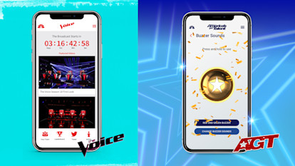
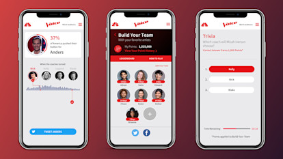
At my time at NBC, I led the UX/UI of the Voice App for Season 18 & 19 and America's Got Talent App for Season 14 & 15. These two apps are paired with the broadcasted episodes for play-along experiences such as voting, building fantasy teams, and answering trivia/polls for points.
At the beginning of each season's timeline I would work with our Product team to prioritize improvements and features to incorporate into the upcoming season. These would be identified through understanding the personas of those who watch The Voice and AGT while using the play-along app, disecting the user journey, auditing the app's accessibility against current standards, and reading through the app store reviews. Once these improvements/features were identified, I would begin my design process. This included conducting an analysis of other products with similar interactions, sketching out possible user flows and interfaces, obtaining feedback through design reviews, iterating these designs, creating prototypes, executing user tests, working with product to identify user data points, pitching my ideas to executives, and creating spec documents of these deliverables.
America's Got Talent - Design Process
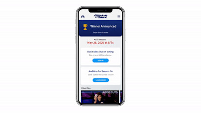
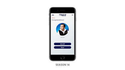
An example of a recent feature I worked on was the Congratulations screen for the America's Got Talent app. This screen appears at the end of the season once a winner is announced and remains present till the start of the next season. After analyzing our app store reviews, a user painpoint was discovered. Because the Congratulations screen is triggered right after the winner is announced, many users would be spoiled of the AGT results when opening the app before actually completing the final episode (say, if they were planning to watch the episode after its broadcast). In addition, we found that this screen could be more beneficial to users who use the app in-between seasons, sharing more relevant and up-to-date information. After discussing with the Product team, we created a requirement to allow for customizeable promo cards in addition to announcing the winner for this screen.
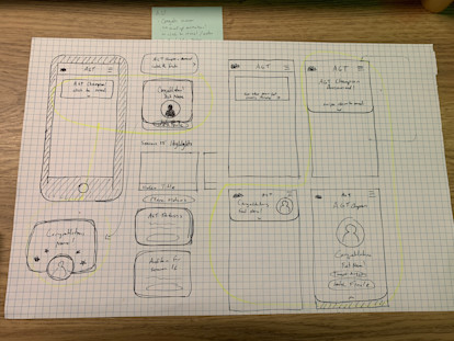
Visually, I found this to be a unique and exciting design challenge. After browsing through inspiration, I concepted various ways that users could interact with this screen to reveal who the winner is. As a brainstorming exercise, I wireframed by hand the possible different states of this screen, allowing an area for promo cards with customizeable copy.
After conceptualizing a few variations of this screen, I brought my designs into Sketch. I approached my initial designs as a playground to explore aesthetic possibilities. I went through several rounds of iteration to visualize styling for the revealing the winner interaction and the promotional cards. I used various AGT assets, such as iconography and show art, as inspiration for adding branding details and texture to this screen. I thought about how animation could be used to add delight to these screens as well.
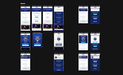
Before deciding on which options to create prototypes for, I went through multiple rounds of peer reviews with members of my team to get their impressions and advice on usability, accessibility, and aesthetics. I incorporated their notes and settled on my top two options to bring into Principle & After Effects to visualize how this interaction would look like.
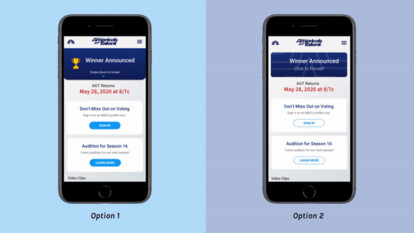
I took these designs to the VP of UX Design for review. Option 1 was preferred because of how it directed the focus of the user with a clear separation of content and its enjoyable interaction that encouraged more engagement. As we were designing for an entertainment app, delightful design is valued greatly.
Once approved by the VP of UX Design, I walked through the chosen design with Product to get their alignment. From there we did a final review with the executive team of our department. Once approved, I delivered the final designs through Zeplin and spec-ed out the animation for our development team. There were three rounds of Design QA in the timeline for the Beta, Alpha, and Release Candidate builds, where I logged bug tickets to ensure that this screen was developed as intended and covered all technical edge-cases. It was released for America's Got Talent Season 15 App.
